Xperia Z vs One vs S4 - Mid-year Android flagship guide
 |
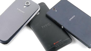
| Arguably the three best Androids currently in the market. Image: Techradar |
It's the middle of the year and anyone looking for an Android smartphone has quite a few great options to choose from. HTC, Samsung and Sony - three of the major Android manufacturers - have already released their respective flagships for the year, and choosing between them can be a bit of a challenge for someone just looking to get their first smartphone, or someone who is looking to upgrade to a flagship from a mid-range or entry-level smartphone. I wrote a post last month with some tips to help potential buyers choose a smartphone which would best suit them based on their needs and preferences. This time I will try to provide a bit more, based on specific flagships for those who are still undecided. This won't be a review, as I don't own and don't have any experience with any of the devices. This will act more as a buyer's guide based on reviews I have read and hands-on videos I have watched, which are quite plentiful to be honest (I spend a lot of time online). I know most people who are new to the smartphone market can get a bit confused with all the jargon and technical talk, so this will be a general guide with minimal technical talk, that everyone will (hopefully) be able to understand. The three flagships up for discussion; Sony's Xperia Z, the HTC One, and Samsung's Galaxy S4.
Being the earliest of the flagships to be released, the major downside of the Xperia Z is that it is using a processor from last year, the Snapdragon S4 Pro. While it is still one of the best mobile processors in the market, the other flagships of this year are all using a newer processor, which is better. Another common complaint about the Xperia Z is it's less than stellar screen. It has a 1080p display, which is the current standard in the market, but viewing angles have been known to be poor. Looking at the screen from any angle other than straight on exposes the flaws of the screen. Another problem with the phone is it's speaker. It's bad. That's all there is to say about the speaker.
Despite these flaws, the Xperia Z has some pretty amazing strengths as well. The most obvious of which is water and dust resistance. This phone is the only one of the three flagships that offer water and dust resistance. Most phones that offer this level of resistance are usually rugged phones with non-flagship specs and a bulky design. Not this phone. High-end specs, water and dust resistance and a very stunning, beautiful design. The Xperia Z was, up until the HTC One, regarded by many as the best built and most beautiful Android smartphone in recent years. If you are not a fan of relatively sharp edges however, the blockish build of the Xperia Z may not appeal to you. Another strength of the Xperia Z over the other two flagships is its close-to-stock-Android software. While Sense and TouchWiz add some great value to Android, people who prefer a more simple and less altered version of Android will like what Sony has to offer. It does offer some tweaks to Android, but overall Sony's skin is much less intrusive than HTC's and Samsung's. As an added bonus specifically for the custom ROM community, Sony are probably the most supportive Android manufacturer when it comes to AOSP, posting code for their products online for download.
 |
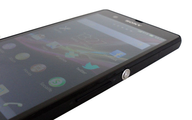
| Looking at the display from any angle exposes a weakness in the otherwise sharp 1080p display. Image: The Register |
 |
| The only flagship to boast water resistance as a feature. Image: Slash Gear |
Cons - Poor quality speakers, bad viewing angles despite a pixel-packed 1080p display, powered by last year's chipset.
HTC One
 |
| The only phone with two navigation buttons. Image: Android Central |
 |
| Why don't other manufacturers put speakers on the front of their phones? Image: HTC |
Pros - Stereo front-facing speakers, best built Android phone in recent years, 4.7" 1080p display is the most dense display among the flagships.
Cons - Aluminium body causes the phone to feel very hot after intense use, poorly placed notification LED, most unusual navigation button layout ever.
Undecided - HTC Sense, UltraPixel camera.
Samsung Galaxy S4
 |
| Spot the differences. Image: Gizmodo |
 |
| The S4 is one of the few smartphones to still offer a removable battery and expandable storage. Image: TechnoBuffalo |
Pros - Expandable storage and a removable battery, the latest version of Android 4.2.2, a plethora of software features in TouchWiz.
Cons - TouchWiz is too heavy and causes occasional lag in everyday use, cheap build quality, uninspired design that is getting stale with every Galaxy device that is released.
Phones to look forward to
What does the second half of they year hold for us? Quite a bit actually. Samsung proved that large phones, if done correctly, can be a huge success in the market. That is why the Note III is possibly the most anticipated phone of the second half of the year. Of course, some may argue that that title belongs to the Nexus 5 (if that's what it's called). The Nexus 4 was undoubtedly the most successful Nexus phone to date, to the extent that Google underestimated demand for it and LG struggled to keep up the manufacturing pace. Another Google phone is also highly anticipated, the Moto X. Everything we know about this phone is pure speculation. If there was an award for most rumoured phone on the internet, it would be the Moto X, which is probably why so many people are eagerly waiting to see what it actually is.
 |
| Is this the mythical Moto X? Image: Techradar |
That's the mid-year guide. Like I said earlier, I don't own and have no experience with any of the flagships, so if you want more information and more in-depth reviews, I suggest you go to any of the popular mobile tech sites out there and do your research.
Have you bought a phone this year? If not, which phone is holding you back? Which phone are you most excited for?


Comments
Post a Comment